هو مشروع أطلقته شابات بريطانيات من أصول تركية في قلب لندن، الهوية البصرية للمشروع تعكس رؤية فريدة تمزج بين التفاصيل الزخرفية التاريخية والبساطة الحديثة Ottoka Living.
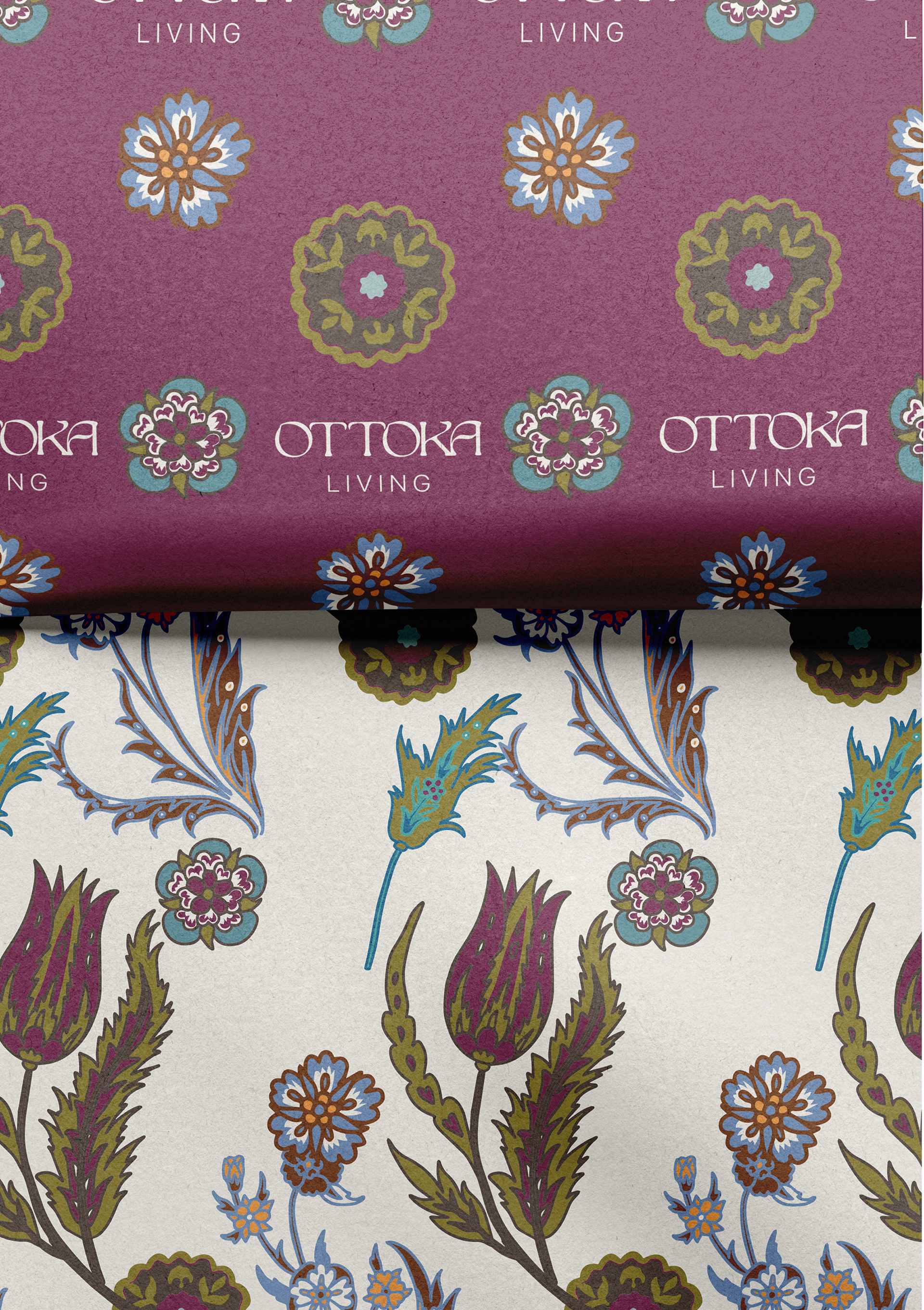
صممنا الشعار بأسلوب أنيق وبسيط، حيث يمزج بين خطوط نظيفة وكتابة مميزة تعبّر عن الطابع الراقي للعلامة التجارية. الألوان الغنية والمحايدة تم اختيارها بعناية لتعكس جمال الزخارف العثمانية وتنسجم مع القوام الطبيعي للمنتجات، مما يخلق تجربة بصرية متناغمة وأنيقة.
صممنا الشعار بأسلوب أنيق وبسيط، حيث يمزج بين خطوط نظيفة وكتابة مميزة تعبّر عن الطابع الراقي للعلامة التجارية. الألوان الغنية والمحايدة تم اختيارها بعناية لتعكس جمال الزخارف العثمانية وتنسجم مع القوام الطبيعي للمنتجات، مما يخلق تجربة بصرية متناغمة وأنيقة.
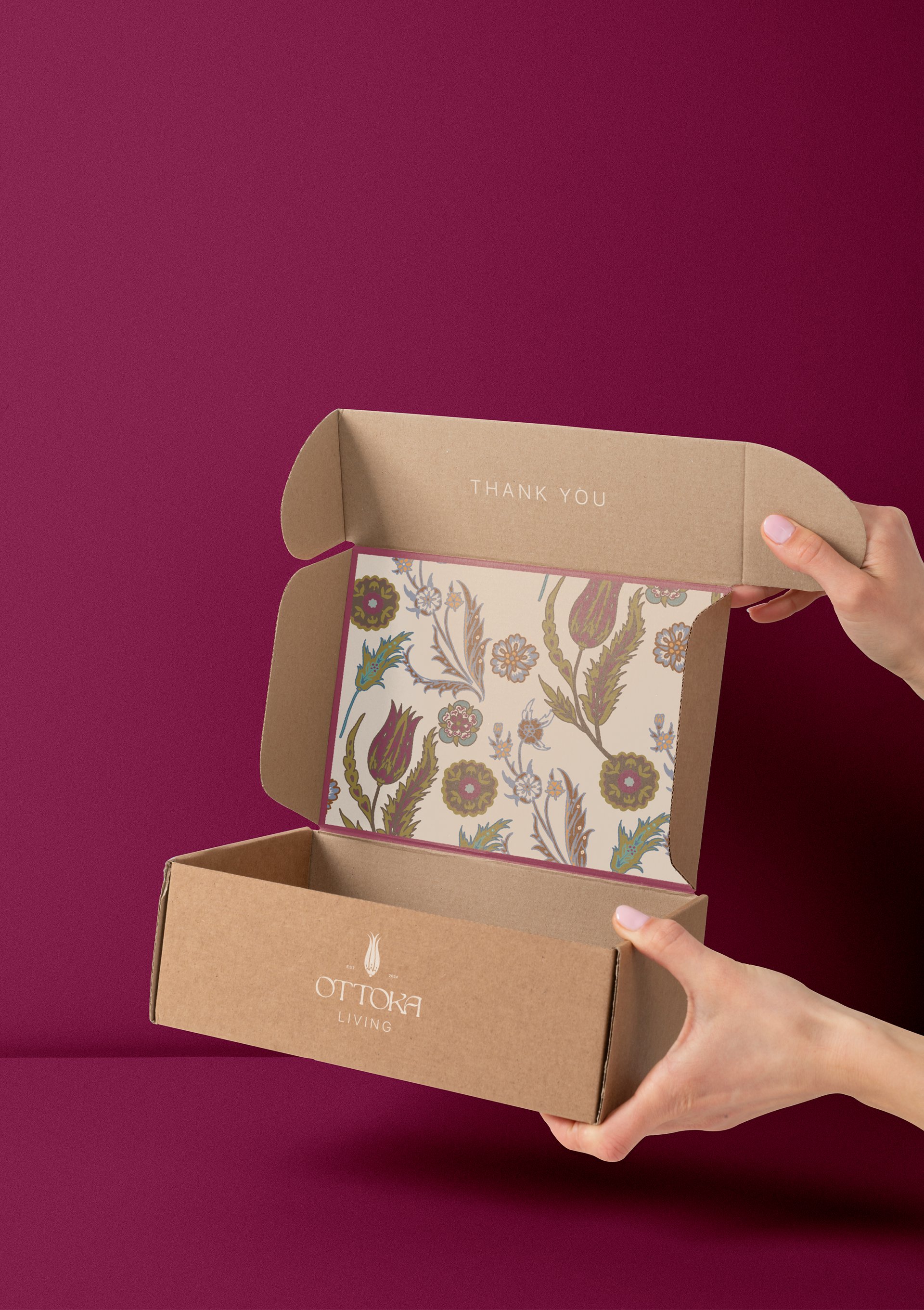
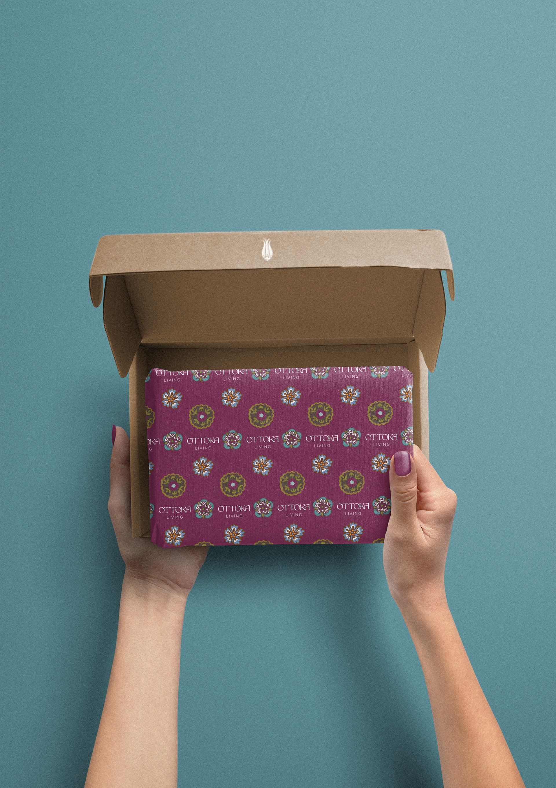
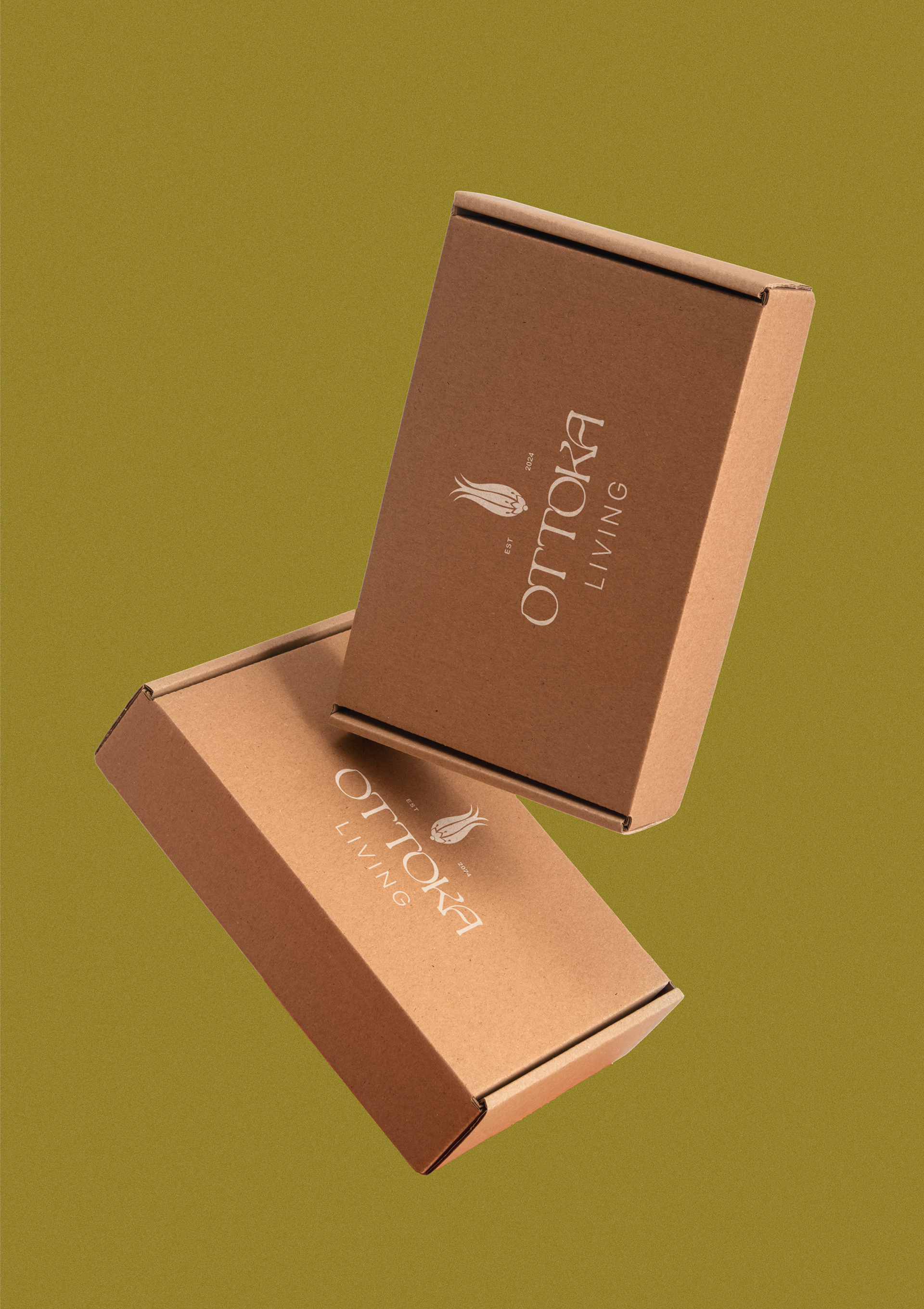
The logo design embraces elegance and minimalism, pairing clean lines with a distinctive wordmark that captures the brand’s refined essence. Rich and neutral colors were carefully selected to highlight the beauty of Ottoman-inspired patterns and complement the natural textures of the products, creating a harmonious and sophisticated visual experience.
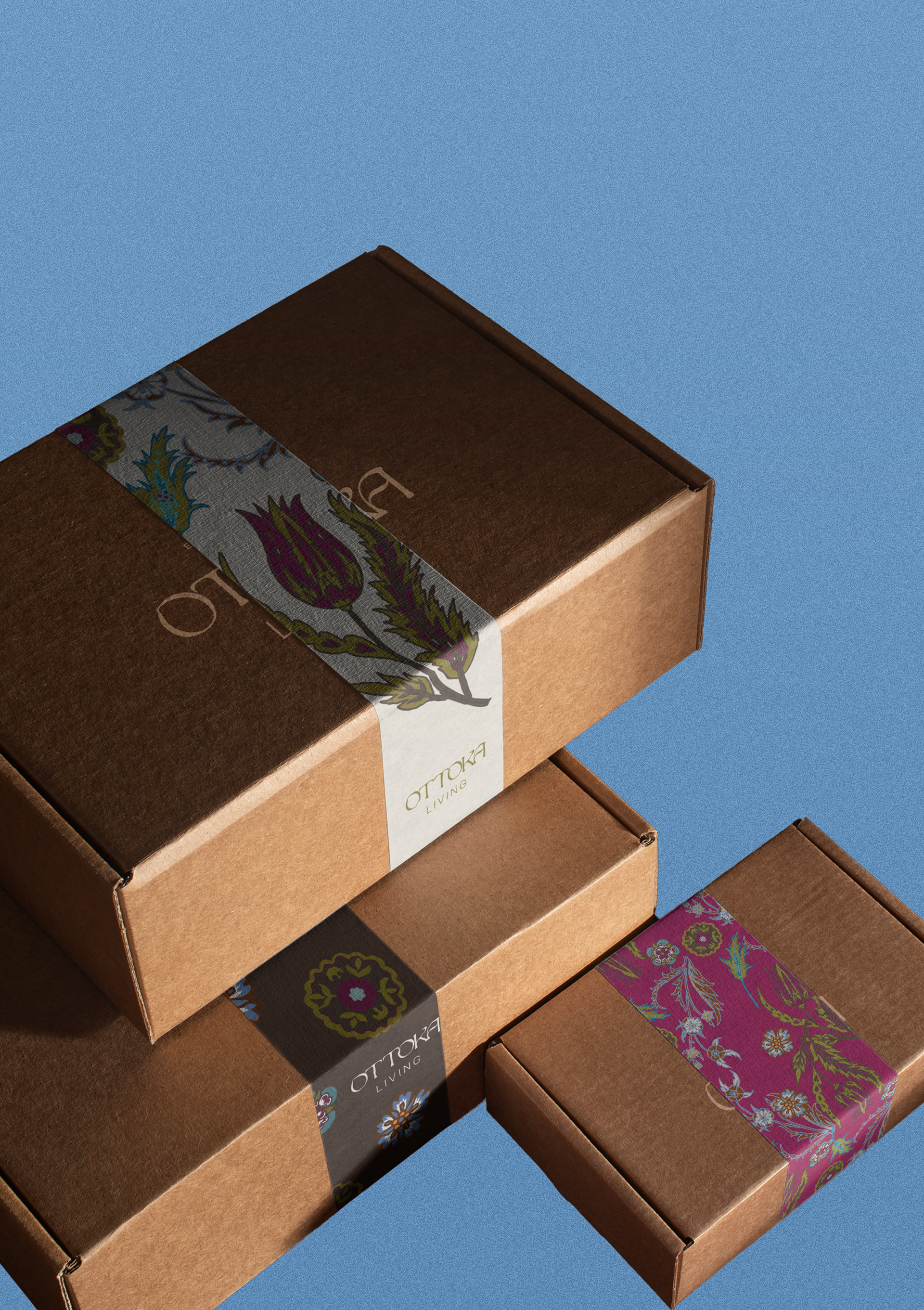
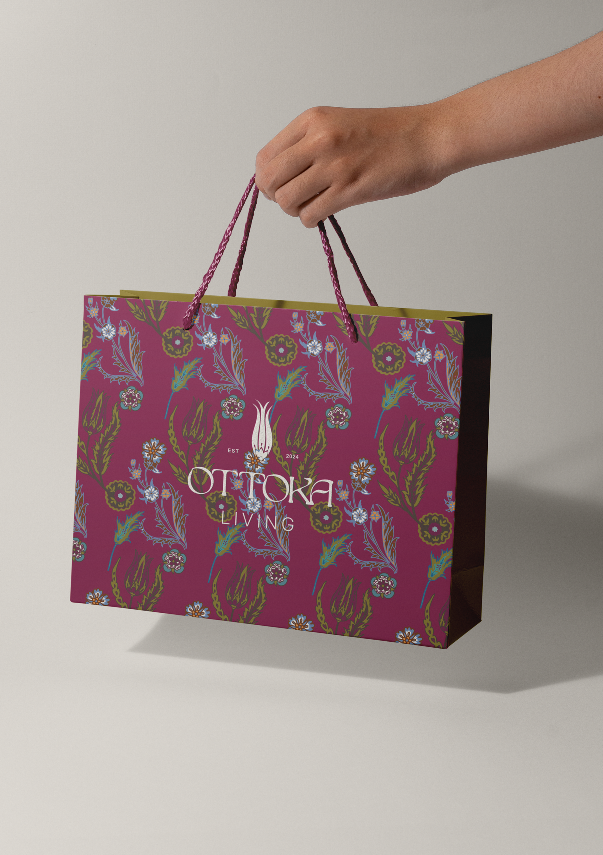
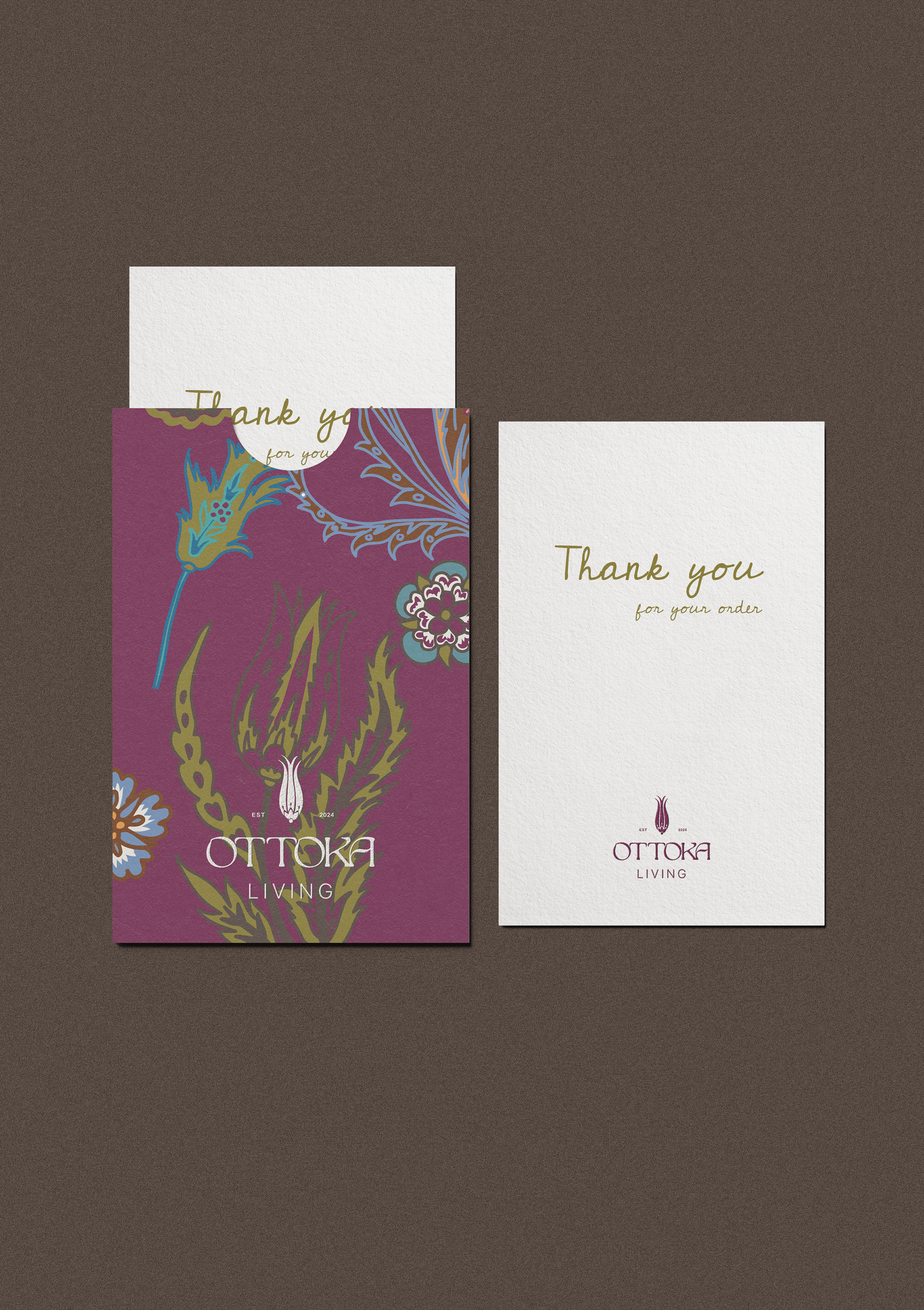
To add depth and uniqueness, ornamental illustrations inspired by Ottoman art were incorporated into the packaging design. These details allow for seamless customization with stickers, tags, and ribbons, ensuring each product feels personal and unique while maintaining the brand’s cohesive and polished identity.